Viewing live and historical platform status
For a real-time overview of your Pexip Infinity deployment, go to . The interactive graphs and charts on this page show at a glance:
- the locations and Conferencing Nodes that are currently deployed and the available capacity and current load on each node
- all conferences that are currently taking place, and the nodes on which they are being hosted
- any conferences or conference participants that are experiencing call quality issues
- any error or warning alarms
- (during an upgrade process) which nodes are currently being upgraded, which nodes are still waiting to be upgraded, and which are in maintenance mode
- pie charts showing a breakdown of participants by location, protocol, license type and the different conference types being hosted.
You can interact with the graphs and charts by hovering your mouse pointer over each item to view specific information on each location, node and conference. You can also drill down to view more detailed current and historical information.
You can filter the view to show specific conferences or participants. You can also choose to remove conferences and backplanes entirely from the view if they take up too much space.
By using the timeline controls, you can rewind and replay the graph to view full node status and conference activities during the previous seven days. For a complete history of all conferences, see Viewing historical information about conferences.

The box at the top of the graph allows you to filter the view by conference or participant name.
The statistics at the top of the graph summarize the platform status. They show the number of participants currently connected to the platform, the number of concurrent conferences, the number of Conferencing Nodes, and the number of externally-hosted conferences (i.e. Microsoft Teams or Skype for Business meetings, or Google Meet).
The issues statistics (in orange) are only shown if any of the participants or individual conferences are experiencing call quality issues. If you hover over this area, the affected participants and conferences are indicated:

You can click to expand the list of issues and you can also review the details of individual participants and conferences:

Each Conferencing Node is represented by a node icon  . Nodes in the same location are grouped together. Hovering over each node's icon provides information about that node's hostname, IP address, current load and estimated capacity (in terms of the estimated maximum number of calls the node can handle). Hovering also highlights all the conferences for which that node is handling the media.

You can double-click to get more detailed node information, including an interactive status chart showing the load history for that node.
Each location is represented by a group of one or more Conferencing Nodes against a colored background. A different color is used for each location. The label gives the name of the location and summarizes the amount of available HD port capacity across all Conferencing Nodes in that location, and shows how much of that capacity is currently in use.

You can double-click to get more detailed location information, including an interactive status chart showing the load history for that location.
Conferences are represented by  icons. Hovering over the icon provides details of the conference, including its duration and a list of participants.
Hovering also highlights all the Conferencing Nodes that are handling media for that conference. Any backplane issues are highlighted — if a backplane link has poor quality, it is shown in red, and if a participant has poor quality, the link between their node and the conference is also shown in red.

You can double-click to get full conference details and to view an interactive conference graph.
- View historical Conferencing Node activities such as nodes being added or placed into maintenance mode.
- View conferences and the nodes on which they are hosted.
- Drill down into individual conferences to review conference activities such as participants joining, leaving or presenting, and examine a participant's media statistics.
- Pause, rewind and replay the graph at a variety of speeds.
The pie charts and alarms list also reflect the selected time period.
Initially you are shown a live view:

You can drag the black dot back to a previous time and view the platform status as it was at that point:

You can then use the control below the middle of the timeline to rewind, fast-forward, play or pause the graph  and you can also choose the speed
  .
.
To maintain optimum system performance, the timeline is not available for large deployments of more than 40 Conferencing Nodes.
The alerts area shows any error and warning alarms. You can click on the alarm for more details and to access troubleshooting information.

The pie charts show a breakdown of:
- Participants by location
- Participants by protocol
- Participants by call license type (port, audio, or not required) — note that this shows total participants; some types of participant calls consume 2 licenses
- Conference types (VMRs, Virtual Receptions, gateway calls etc.)
You can hover over an area of the chart to see more information.
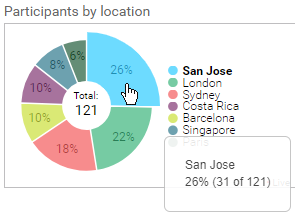
If you click on a pie chart you are taken to a more detailed interactive graph showing historical information about those locations, protocols, licenses or conference types, where you can filter out or select specific elements e.g. you could choose to only view participants using the SIP protocol, or all participants except those in the London location.

More information about the graphs and charts, and how to interact with them, is shown below.
Key to icons and symbols
The status graphs use the following symbols:
| Icon | Meaning | Icon | Meaning | |
|---|---|---|---|---|
| Management Node | ||||
|
|
The Management Node in normal operation. |
|
The Management Node with an error-level alarm. | |
|
|
The Management Node with a warning-level alarm. | |||
| Conferencing Nodes |
||||
|
|
A Transcoding Conferencing Node during normal operation. The amount of green fill within the circle indicates the current media load (in terms of percentage of estimated HD ports in use), so an unused node is white and a fully loaded node is filled entirely green. |
|
A Proxying Edge Node during normal operation. The amount of green fill within the circle indicates the current media load (in terms of percentage of proxying capacity in use), so an unused node is white and a fully loaded node is filled entirely green. | |
|
|
A cloud bursting node that is currently on standby i.e. stopped. |
|
A node that is in maintenance mode. | |
|
|
A cloud bursting node that is currently starting (green circle spinning clockwise) or stopping (spinning counter-clockwise). |
|
A node that is waiting to be upgraded. When you begin an upgrade of your platform, all nodes will have this status but will still be able to handle calls. After each node is upgraded in turn, it will return to normal operation. | |
|
|
A node that has an error-level alarm. |
|
A node that is currently upgrading. | |
|
|
A node that has a warning-level alarm. | |||
| Teams Connectors | ||||

|
When Azure Event Hub is not enabled, Teams Connector instances are only displayed when they are currently involved in a Teams call. Each purple square represents a Teams Connector instance. |

|
When the Azure Event Hub is enabled, all Teams Connectors that are integrated with Pexip Infinity are shown. Each purple square represents a Teams Connector instance and the fill level of the square represents the current media load. A filled square in lighter purple represents an instance that is draining. | |
| Conferences |
||||
|
|
Conference being held in a Virtual Meeting Room. |
|
Gateway call. | |
|
|
Conference being held in a Virtual Auditorium. |
|
Call to the Test Call Service. | |
|
|
Call to a Virtual Reception. |
|
A Skype for Business meeting. | |
|
|
Call to a Media Playback Service. |
|
A Microsoft Teams meeting. | |
|
|
A conference that is experiencing call quality issues displays a blue asterisk next to the conference icon. |
|
A Google Meet meeting. | |
|
|
Conference is locked. | |||
| The labels shown against each conference are based on the name of the VMR, Virtual Auditorium and so on, or the Call Routing Rule name for gateway calls. | ||||
| Participants | ||||

|
The participant is currently presenting content. |

|
API participant. | |

|
Streaming participant. | |||
|
|
||||


 (Rotating)
 (Pulsating)
 (Pulsating)
 (Pulsating)


Platform summary status, call quality issues and alarms
The statistics at the top of the graph summarize the platform status. They show the number of participants currently connected to the platform, the number of concurrent conferences, the number of Conferencing Nodes, and the number of externally-hosted conferences (i.e. Microsoft Teams or Skype for Business meetings, or Google Meet).
The issues statistics (in orange) are only shown if any of the participants or individual conferences are experiencing call quality issues. If you hover over this area, the affected participants and conferences are indicated.
You can click to expand the list of issues and you can also review the details of individual participants and conferences.
The alerts area shows any error and warning alarms. You can click on the alarm for more details and to access troubleshooting information.

The interactive timeline indicates in blue any times in the past when a participant or backplane had call quality issues. You can hover over each blue bubble to get details of the issues that occurred at that time. In very large/busy systems with poor networks this is limited to the last 10,000 events over the last 7 days.
Pie charts and detailed participant usage graphs
The pie charts show a breakdown of:
- Participants by location
- Participants by protocol
- Participants by call license type (port, audio, or not required) — note that this shows total participants; some types of participant calls consume 2 licenses
- Conference types (VMRs, Virtual Receptions, gateway calls etc.)
You can hover over an area of the chart to see more information.
If you click on a pie chart you are taken to a more detailed interactive graph showing historical information about those locations, protocols, licenses or conference types, where you can filter out or select specific elements e.g. you could choose to only view participants using the SIP protocol, or all participants except those in the London location.
This example here shows the participants by location history graph, but all of the other graphs (protocol, license, conference type) work in the same way. You can:
- Click on individual locations (or protocols, licenses, conference types) to include/exclude them from the chart.
- Grab and move the vertical timebar up or down to adjust the time period that is displayed, or move the bar left or right to show the breakdown of participants for that point in time, or just click anywhere on the graph to move the vertical timebar to that point. The historical data is captured at 10 minute intervals.
- Adjust, or grab and move the timebox area in the bottom graph to quickly change the date and time period that is displayed in detail in the main chart. You can double-click on the bottom graph to reset the main chart to zoom out to show all available data.
- Grab and move the legend to another area of the chart.
Viewing location status
Each location is represented by a group of one or more Conferencing Nodes against a colored background. A different color is used for each location. The label gives the name of the location and summarizes the amount of available HD port capacity across all Conferencing Nodes in that location, and shows how much of that capacity is currently in use.
You can double-click to get more detailed location information, including an interactive status chart showing the load history for that location.
The example here shows the Costa Rica location, which is current using 43% of the 64 available HD ports.
Viewing Conferencing Node status
Each Conferencing Node is represented by a node icon . Nodes in the same location are grouped together. Hovering over each node's icon provides information about that node's hostname, IP address, current load and estimated capacity (in terms of the estimated maximum number of calls the node can handle). Hovering also highlights all the conferences for which that node is handling the media.
You can double-click to get more detailed node information, including an interactive status chart showing the load history for that node.
The example here shows the information that is available for one of the four Transcoding Conferencing Nodes in the San Jose location.
Viewing Teams Connector and Teams meeting status

You can view the status of each Teams Connector instance, such as call capacity and current media load, when you hover over an instance , providing enhanced Teams status information is enabled.
If enhanced status information is not enabled then Live View only displays Teams Connector instances when a Teams call is in progress.
Each purple square represents a Teams Connector instance. A single instance can handle more than one Teams meeting; if you hover over an instance you are shown all of the Teams meetings that it is currently running.
You can also hover over an individual Teams meeting to see a list of all the participants, and highlight those who are gatewayed into the meeting
Viewing conference status
Conferences are represented by icons. Hovering over the icon provides details of the conference, including its duration and a list of participants.
Hovering also highlights all the Conferencing Nodes that are handling media for that conference. Any backplane issues are highlighted — if a backplane link has poor quality, it is shown in red, and if a participant has poor quality, the link between their node and the conference is also shown in red.
You can double-click to get full conference details and to view an interactive conference graph.
The example here shows the information that is available for the conference being hosted in the meet.Regenia Virtual Meeting Room. The conference is experiencing one backplane issue.

Gateway calls to externally-hosted conferences
When viewing a Gateway call to an externally-hosted conference, such as a Microsoft Teams or Skype for Business meeting, or Google Meet, all of the externally-connected participants are listed (grayed out).
When you hover over the external conference it also shows you which Conferencing Node it's connected to, and a link to the associated Pexip gateway call.
Filtering by participant or conference

The box at the top of the graph allows you to filter the view by conference or participant name.
When you enter text in the filter box, you will see only:
- Conferences with the text in their name,
- Conferences with the text in their service tag,
- Conferences which contain a participant with the text in their name, and
- Conferences which contain a participant with the text in their alias.
You can also apply a filter to an individual conference graph.

When a filter is applied in live view, the timeline at the bottom of the page indicates in yellow all the times in the past when there was a conference or participant matching the filter. If you hover over these yellow indicators, information about the match will appear.
If you select a conference to view while the filter is applied, or you apply a filter to conference graph, any participants whose name or alias matches the filter text are highlighted in the conference graph. When viewing a conference graph with a filter applied, the timeline indicates in yellow whenever there was a participant in the conference who matched the filter. Again, if you hover over these yellow indicators, information about the match will appear.
Rewinding and replaying status
You can use the controls
- View historical Conferencing Node activities such as nodes being added or placed into maintenance mode.
- View conferences and the nodes on which they are hosted.
- Drill down into individual conferences to review conference activities such as participants joining, leaving or presenting, and examine a participant's media statistics.
- Pause, rewind and replay the graph at a variety of speeds.
The pie charts and alarms list also reflect the selected time period.

The following controls are available:
| Control | Description |
|---|---|
|
|
Use the control at the bottom left of the timeline to select the speed at which to rewind or replay the graph. |
|
|
Use the control below the middle of the timeline to rewind, fast-forward, play or pause the graph. |

|
Drag the black dot to view a particular point in the timeline. The selected date and time are shown above the timeline. |
|
|
When viewing historical information, the date and time of the graph currently being displayed is shown at the bottom right of the timeline. |
|
|
To return to the live view, drag the black dot to the far right of the timeline, or fast-forward to the end. When you are viewing the live graph, "Live" will be shown at the bottom right of the timeline. |
To maintain optimum system performance, the timeline is not available for large deployments of more than 40 Conferencing Nodes.
Remove conferences from Live View
You can control whether conferences and backplanes are shown in the Live View graph. If you have a very busy deployment, it may be useful to clear conferences and backplanes for an improved viewing experience.
To remove conferences and backplanes from the Live View:
- Go to
- Clear the Show conferences and backplanes in Live View option.
- Select Save.
Note that when conferences and backplanes are removed, the conferences and participants counts in Live View are not shown.